You will agree that making marketing emails readable is just as important as getting people to sign up as an email contact. You will also agree, if you are handling email marketing yourself instead of outsourcing it to us, that the task of creating and sending eblasts or email campaigns takes substantial time and energy in order to avoid sending out a half-baked, sloppy looking email to your audience.
It requires focus on planning, copywriting, branding, and image design, as well as ongoing A/B testing, patience, and attention to detail.
Mobile-friendly email marketing typography and readability
Before you hit send, have you made sure your email is easy to read on various devices? Most email marketing platforms have preview and “send test” capabilities that will help you check and improve the readability of your email on mobile devices.
Create user-friendly emails by following these five email typography best practices:
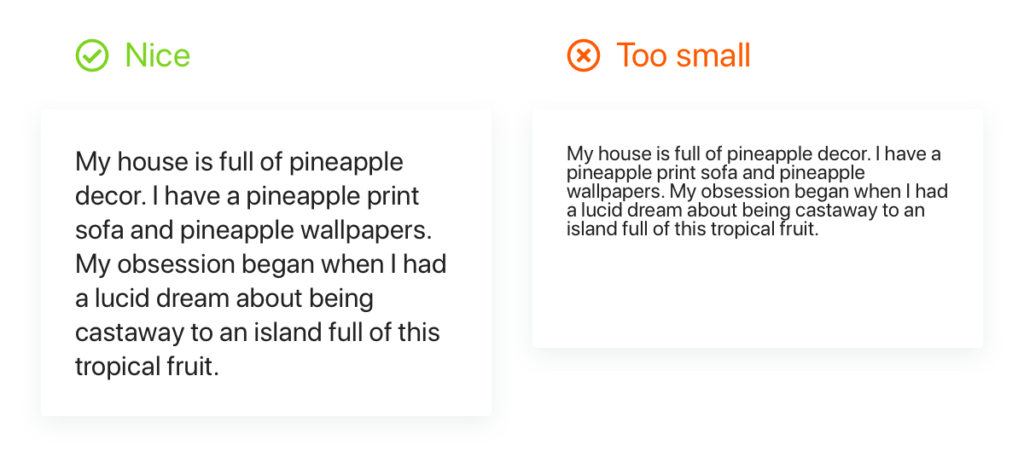
1. Avoid eyestrain by using a bigger font
Use at least 16px font size for all your content. Mobile devices shrink font sizes, so 12px font or smaller would be unreadable.
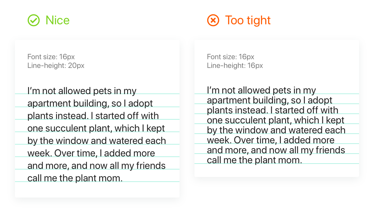
2. Have enough line spacing
Ensure your line-height is at least 120% of the font-size. To find the line-height, add 4px to your current font size (e.g., 16px font-size with a 20px line-height).
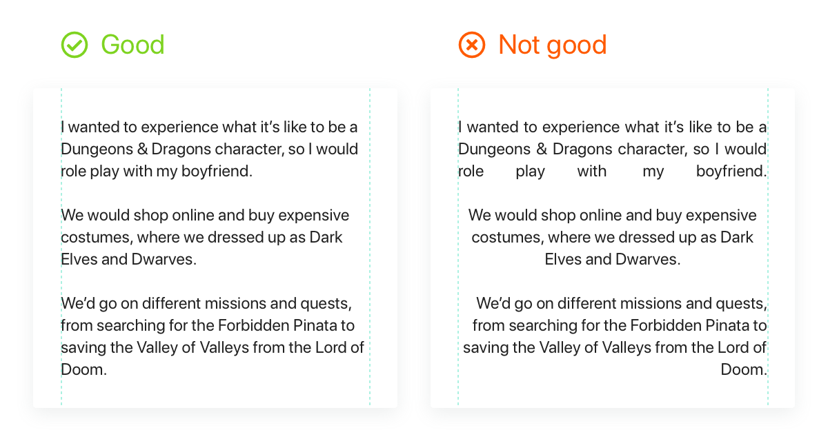
3. Be consistent: Stick to left alignment
Left alignment makes it easy for readers to find the start of the next line. So, always use left alignment for your main text.
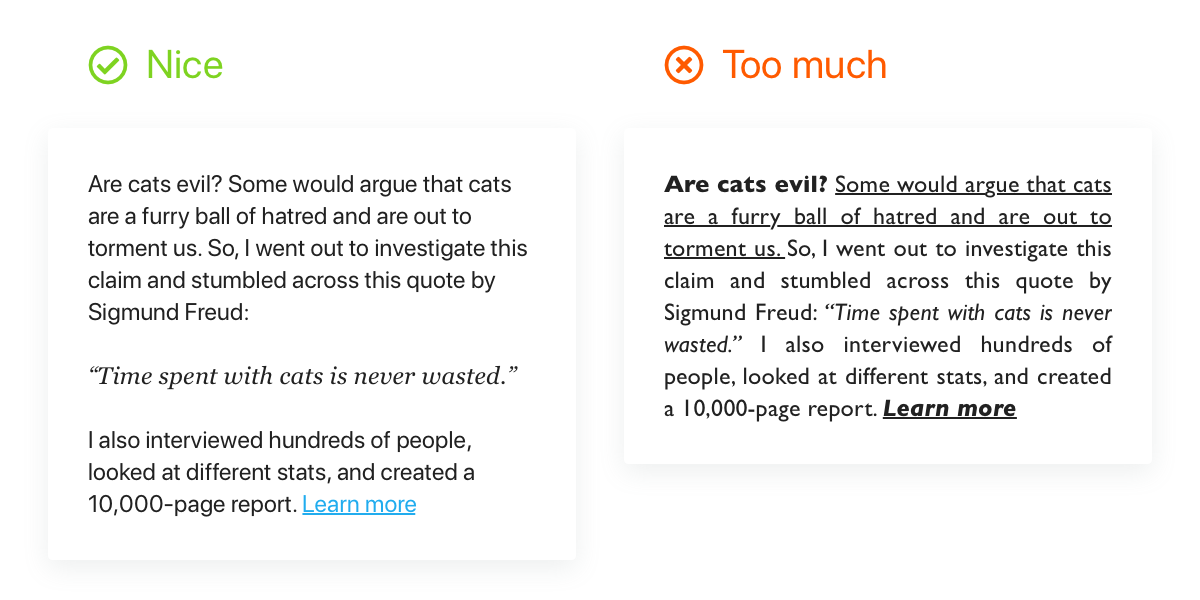
4. Use character styles sparingly
For more effective copy, use all capitals, bold or italics text, and underlining sparingly. If you’re not linking to a different page, try to avoid underlining text since it indicates a link.
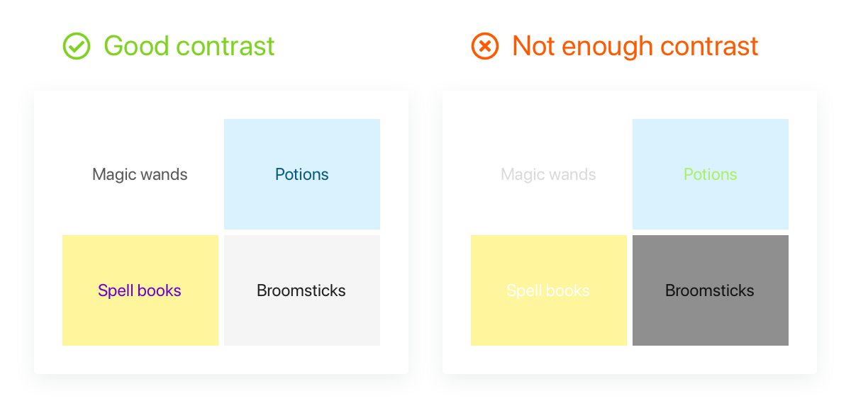
5. Make your email pop with color contrast
Colors that have a lower contrast ratio can be difficult to read, especially for people with visual impairments. Contrast checker tools can help you choose the right ratio.
Pro tip
Limit the number of links you include in the copy. Related to #4 – character styling – the inclusion of too many links makes the email harder to read and looks messy. It also distracts your reader from your email. Think: Why would you want to include links that are likely going to take their eyeballs off of your content or your conversion goal?
Closing advice: Clear typography and messaging for email marketing
It’s said that making copywriting clear is more important than making it clever. Apply a similar guide to keep your emails more readable and productive: making your email marketing clear is more important than making it pretty; don’t go overboard with typography, graphics, photos and colors.
SafeHouse Web is a Silicon Valley digital marketing company in Hollister, California, that provides full-service digital marketing solutions. To learn more about our client-trusted digital marketing, website design and social media advertising services, contact us today.


