
Online forms are such a huge part of all web content. We use forms to generate leads, conduct research, run surveys, and accept payments. However, unlike websites, fewer people are talking about form-optimization. And that’s a shame! After all, if your website is brilliant, but your online forms are no good — your online business is very unlikely to succeed. In this guide, we will cover the strategies to design better online forms that can outperform all expectations.
Make Your Forms Stand Out
Let’s face it, forms aren’t that exciting on their own. If a user sees a web form on your website or in an email, they’re likely to scroll right past it unless something about it catches their eye. In order to do that, you have to implement a creative and effective design, while also building trust.
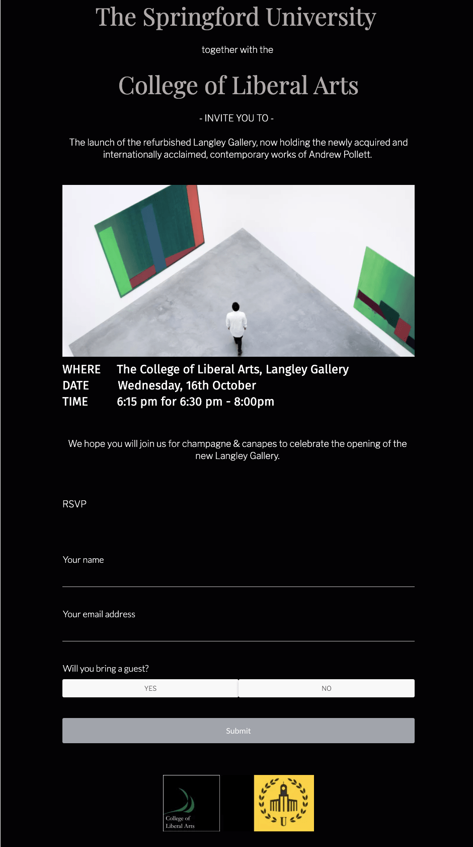
Your forms should represent your brand. That’s a great place to start when it comes to establishing trust with responders. According to a survey of 16,000 customers across eight global markets, 81% of responders said that trusting a brand to do the right thing will have an impact on their decision to use that brand’s goods or services. If you’ve spent a long time trying to build a better brand, you should be attaching it to everything you do!
That includes your forms.
Add your business logo, your slogan, and your company colors to your forms. Not only will it help something that might otherwise be simple and “boring” to stand out, but it will immediately help to establish trust with your responders, and you’re more likely to get more responses.
Structure Your Forms Well
Again, a plain-looking form can turn responders off for a variety of reasons. If it doesn’t look interesting enough, they might bypass it completely. Alternatively, if it looks long (like a survey or quiz), they might feel overwhelmed by it.
In addition to creating forms that stand out, they have to be structured in such a way that they aren’t intimidating or overwhelming to potential responders.
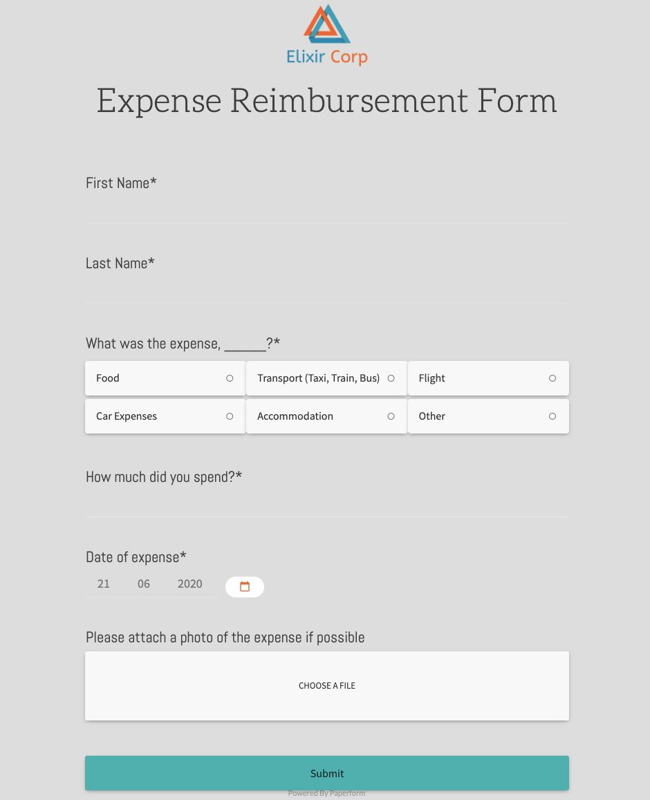
One of the best ways to do this is to break down your forms into smaller chunks. Give each of those chunks a ‘category’ or title. This can make your forms seem more manageable, and it will let your responders know what’s coming up, so they will have time to start thinking about how they will respond.
In addition to breaking up your forms in chunks of content, make sure the content fits within each of those sections. Everything should be organized concisely in a way that makes sense. Don’t jump around with different subjects. Try to group questions together that seem to fit under the same categories in order to make the process easier for your responders.
Add Navigation To Your Forms
When you’re designing your forms, it needs to be about more than just the right colors. Your responders should have an easy way to navigate through the forms. One of the best ways to do that is with a “% complete” bar either at the top or bottom of the form. This will let your responders know how much they’ve already completed and how much they have yet to go.
While it might seem like a small tactic, it’s actually very effective. When a responder sees how much they’ve already done, they are less likely to “give up” on the rest of the form. Plus, if they see that they only have a small percentage left to go, it’s a motivational tool that will help them to finish. You’re only going to get the best, most accurate data from fully-completed forms. So, you want to do things that will encourage your responders to fill out every answer. Navigation is key when it comes to eliminating confusion and boosting motivation.
Communicate Clearly And Personally
It’s important to remember that no one is being forced to fill out your forms. They’re doing so on their own time. Maybe you’re offering some kind of incentive, or maybe you’ve just asked responders to share their experiences when it comes to your business.
In any case, the last thing you want to do is waste your responders’ time or confuse them in any way. So, make sure you’re communicating clearly, concisely, and personally through your forms.
People are inundated with advertisements and marketing techniques nowadays. Showing some personality through your forms can help your business to develop a more humanistic quality, which most consumers tend to appreciate. After all, most people would rather feel like they’re talking to another person, rather than a robot or computer.
So, use language within your forms that people will understand and feel comfortable with. Talk to your responders as if you’re old friends, and speak casually about your company and what you do. Not only is this another great way to build and establish trust, but it can help your responders to feel less intimidated by the forms in front of them, and more comfortable as they answer. As a result, you’re more likely to get accurate data.
Summing It All Up
To summarize, make sure that your forms aren’t just functional, but also beautiful. Build trust with your responders by making sure that your forms truly represent your brand and company, structure your forms well, communicate appropriately — and your forms will go a long way.
It’s important to choose the right platform to build and maintain your online forms. In the past, we used to build every form from scratch in HTML, but that’s not scalable and very time-consuming. A much more efficient solution is to use a form builder. Google Forms is a free option that normally works well for very simple forms but lacks advanced features. If you’re looking to create professional forms that involve collecting payments or conditional logic — you might look at a professional form maker like Paperform.
_____________________________________________________________________
This post was written by Vlad Shvets from Paperform.