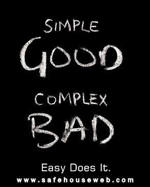
 Choices are great on a menu, but too many choices on your website or landing page or even within your products can cause indecision. Too many choices can lead to confusion, and when you’re in the business of trying to make a sale, confusion is the enemy. What’s the opposite of confusion? The answer is easy. The best way to make things easy? Keep them simple.
Often we’re too focused on giving our customers too much. When you go to the barber, he doesn’t give you a menu of haircuts. You sit down, tell him simply what you’d like done, he pulls out his tools and cuts your hair. All very quickly and without fuss, which is the reason most men still prefer to go to a barber rather than a “salon”: It’s simple.
Now, if you were to sit in that same barber’s chair and he gave you a 20-question survey about what type of hairstyle you prefer before he started cutting, you’d not only be annoyed, but most likely never go to him again.
Let’s look at an online example to further prove the point. Imagine you’re visiting the e-commerce store of your favorite pet supply retailer. You need a new collar for your Labrador, Chaser (yes, that’s my dog’s name!). Upon arriving at the site’s dog collar section, you find 20 different types and brands of collars. There are fancy collars, cheap collars, chain collars, collars for small and big dogs, collars with diamond studs on them, fashionable collars, and many more. Whew… you’re faced with lots of choices.
“Great,” you say. “I love it that this store has so many choices, I came to the right place.”
But perhaps it’s not so great. Having too many choices might be a problem. You just wanted to get a collar. You were ready to buy one. But now, well, you’ve found out that there a lot of decisions you need to make before you buy one. You think to yourself, “I had no idea there were so many collars. I like so many of them, I don’t know what to choose.”
So you didn’t buy. You were ready to, but it didn’t happen. Chances are this has happened to you at some point in your buying life, and chances are what happened was that you were ready to decide, but the explosion of choices either confused you, or made you realize that you weren’t ready to decide. Effective sales and marketing is all about helping the customer make a decision, and simplicity is necessary to make that happen.
Here are some ways your site might be confusing customers:
- Poor navigation so your customer has to figure where to go
- Too many choices of products and services without a clear indication of which one is the right choice for the customer
- Tons of drawn-out copy that nobody wants to read
- Requiring a customer to register before they can buy from you
Are you guilty of overcomplicating customers’ choices on your website? Think about ways you can make it simple – and you’ll find that making the sale gets much easier.
Online sales could be the main focus of your business, or maybe it’s a sideline to your already successful services; either way, you want to have reliable system and ease of use for you and for your customer. WordPress offers a number of eCommerce themes and plugins that are designed to sell both physical and digital products.

