Elrond Lawrence was new to his position as communications director for the Episcopal Diocese of El Camino Real when he learned that he would be tasked with shepherding a full rebrand of the diocese’s digital content. The catch? The diocese had just one phrase as the starting point for launching their rebrand: RealEpiscopal.
When I asked Elrond about the inspiration for RealEpiscopal and what it meant, he said, “We wanted to find a way to involve our name, El Camino Real, and this was a clever way to share the roots of our diocese and play with the multiple meanings of the word real.”
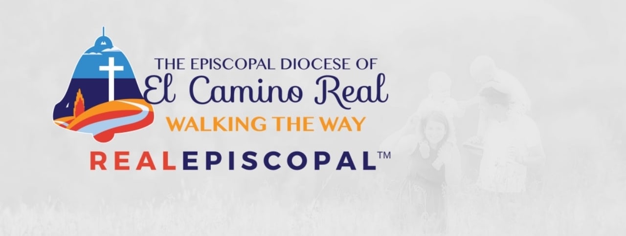
The pronunciation of realepiscopal reflects the Spanish influence that named their community El Camino Real, or “the King’s Highway.”
Elrond gave credit for the phrase to Heidi Zamzow, a member of the communication commission, for the rebrand.
“She came up with the phrase and everyone loved it. When I came into my position and heard the concept, it felt right to me too. We’re not just playing off our name,” he pointed out, “and we’re not saying that we are the only ‘real’ Episcopal church. What this represents is our striving to carry out the ideals and values of our faith. This is our benchmark; we are striving to be real in our outreach, our faith, our values, and our connection with our community.”
From One Phrase to a Comprehensive Rebrand
Elrond turned to Scott Kindred and the SafeHouse Web team to expand the phrase and concept behind RealEpiscopal into an overarching brand that would ultimately redesign their website, e-newsletter, and print magazine.
“The project was a blank canvas with just a phrase to go off of,” said Elrond. “Scott and his team ran with the idea in every conceivable way. Scott immediately understood our goal to stand apart from the stuffy perceptions that people have of church and to share that we are contemporary, accessible, progressive, and approachable to the community. Scott helped us capture the energy of what we are.”
The first step that Scott and Elrond took was to create a logo for the new brand.
“Every diocese has a traditional seal logo,” said Elrond, “and we wanted to break away from that. We are a young diocese, just forty years old, relatively new compared to others that have been around for a century. An intentional part of our rebrand was to step away from the traditional and forge our own image. Scott understood all of that. He was great at listening and understanding our needs.”
![]() The new logo quickly became the centerpiece of everything that SafeHouse Web created for the diocese. It informed and set the tone for both the print and digital elements. They also took the important step of trademarking RealEpiscopal, which was brought up early in the process of the rebrand.
The new logo quickly became the centerpiece of everything that SafeHouse Web created for the diocese. It informed and set the tone for both the print and digital elements. They also took the important step of trademarking RealEpiscopal, which was brought up early in the process of the rebrand.
“Our Canon Brian Nordwick first raised the idea of the trademark, and we all thought it felt right,” said Elrond. “The trademark felt like a new chapter for us.”
They reached out first to a local law firm to be guided through establishing a trademark, and once that and the logo were complete, Scott and his team were there to get the logo in all the right places on the website.
“The logo gives this splash of color to our website,” said Elrond. “It is amazing how much life it has brought to all our digital pieces.”
The logo also gave a much-needed face-lift to their social media accounts.
“Everything looked older and outdated,” says Elrond. “We didn’t want to turn people off the moment they discovered us. We want to reach a younger audience.”
A Gateway to Community
With the logo and trademark in place, the website was the next priority. It was important to Elrond that when arriving at the website, viewers didn’t necessarily think “church.”
“We support forty-two parishes, so in some ways the diocese is the gateway to those churches,” said Elrond. “Our ‘church door’ now has a modern look and a way to convey those messages that feels contemporary, easy to read, colorful, and vibrant. It conveys our qualities and values. So many Episcopal websites are about the building, the stained glass. We wanted our website to reflect a welcoming place. We wanted viewers to see community, ministry, and people,” he said.
Another piece of Elrond’s strategy that was reinforced by SafeHouse Web was to get ahead of the curve (rather than just catch up to) current web technology and design trends. The initial redesign was about the look and feel of the website, while the next version became about conveying specific messages and tone. These aspects of the website were deeply important to Elrond, knowing that faith and religion often get a bad rap.
“What you see in the news are often judgemental messages. We are about inclusion and tolerance. The tone and message we want to convey about the Diocese of El Camino Real is that we are welcoming. The website really reflects that now.”
From Digital to Print
Also reflecting the changes in message and tone is the e-newsletter, originally titled Along the King’s Highway.
“A lot of people in the church had no idea what that meant,” laughed Elrond. “It had lost some of the association with our diocese.”
By removing the old name and including the new logo, the bimonthly e-newsletter was brought into the family of the RealEpiscopal brand. Elrond then moved on to the print magazine, launched in 2017 as a biannual publication.
“We used the name Real Episcopal for the magazine right away, but the old cover design didn’t reflect the colors and feel of the logo,” said Elrond. “The magazine is the last lingering piece that will bring together our visual identity,” said Elrond.
With a new nameplate and cover, the Real Episcopal magazine will be consistent with all the communication vehicles for the Diocese of El Camino Real.
Pilgrimage to a New Identity
The Diocese of El Camino Real entered the new year with not just a rebranded identity, but also a new bishop and the guiding theme of pilgrimage for 2020. Bishop Lucinda Ashby’s theme, A Call to Pilgrimage, mirrored the journey that the diocese had just completed in confirming their brand identity and giving that identity a voice through their communication vehicles.
Elrond reflected on the idea of pilgrimage and the diocese’s season of transition. “Outgoing Bishop Mary Gray-Reeves started this process of the rebrand. She was the person that blessed this rebranding journey. She gave us the creative freedom that we could come up with anything and present anything to her. Both she and incoming Bishop Lucinda Ashby loved that they could share the new website with anyone and people could see our ministry through it.
“Pilgrimage has to do with traveling lightly,” Elrond continued, “staying balanced, not being afraid to get lost, and thinking beyond church walls. People used to go to church and expect the community to show up. We feel that our ministry is now about us being part of the communities we serve and reaching beyond our walls. Having a fresh logo and brand helps because we can represent ourselves to the community. They see it and don’t think of us as church; they think of us as part of their community.”

And community reactions to the new website and newsletter have been positive.
“People are seeing and appreciating our stories,” said Elrond. “They are focusing on our content, rather than being distracted by an outdated design. I love that I don’t have to apologize for a stuffy, old newsletter. I can share links and know that people are going to enjoy the content. The redesign has removed barriers, and now we can focus on taking our storytelling to a new level. We can be more daring, and our final website redesign with SafeHouse Web is going to be the icing on the cake.”
Looking Back to Look Forward
When asked to reflect on the change that this rebrand has made on his day-to-day, Elrond said, “My day-to-day has been unusual for a while because of our bishop transition. I was consumed with getting the house in order, in terms of the marketing plan. With the rebrand in place, the biggest change is that I can focus more on storytelling.”
Elrond spent the early years of his role thinking about the communication vehicles: the website, the e-newsletter, and their social media accounts. With the rebrand complete, he is relying on his experience as a photographer and journalist, going out in the community and gathering both stories and images of how the diocese is impacting the communities within El Camino Real.
“I get to be more strategic about going deeper and finding stories that unite and inspire the congregations in our diocese,” he said. “We don’t have to reinvent the wheel. We can support the process of our congregations uplifting each other through the storytelling we do on our website and newsletter. With the rebrand in place, I am free to focus on the stories we want to tell as a diocese.”
He reflected further on the journey that the rebrand has taken. “I had the rare opportunity to design this communications program from the ground up. SafeHouse Web helped us realize the vision that we had, and it has been successful on so many levels. We have a brand and a look that cause other dioceses to take notice. But more importantly, we are able to convey our mission. It’s not just a great-looking communications program or having a visual identity that holds its own with any organization or nonprofit in the community. It is that I can now focus on how to tell smarter, more creative, and deeper stories about our community.
“I think less about the nuts and bolts,” he continued. “I can think about the heart of our storytelling. This is all we do: enriching people’s lives and having a community that serves them through the highs and lows of life. I tell stories about the people we are serving. The rebrand of the Diocese of El Camino Real released us to focus on the heart.”
Elrond reiterated to me the theme of pilgrimage that has bookended the rebrand and his work with SafeHouse Web. He summed up the overall experience, saying, “These six years have been a pilgrimage for our diocese in terms of finding our soul, the way we tell stories, and the way we connect with the community. It took us a lot of time to find our way. We are El Camino Real. We are the King’s Highway. We’ve been traveling down that highway a long time, and I think we’ve finally found our way.”
Check out the brand design for the Diocese of El Camino Real. To learn more about our branding services, contact us.